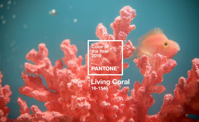
This year’s Pantone #Color of the Year is a very feminine one. It is described by Pantone as an “animating and life-affirming shade of orange with a golden undertone” For me, it’s quite a strong color and it’s best to use it as an accent color rather than flooding your room with this Pantone 16-1546 Living Coral hue.
This year’s color reminds me of underwater corals that are vibrant and ‘living’ hence the name ‘Living Coral’ If you are designing your #space and you want to splash some color of the year into it, there are different hues of coral you can choose from.

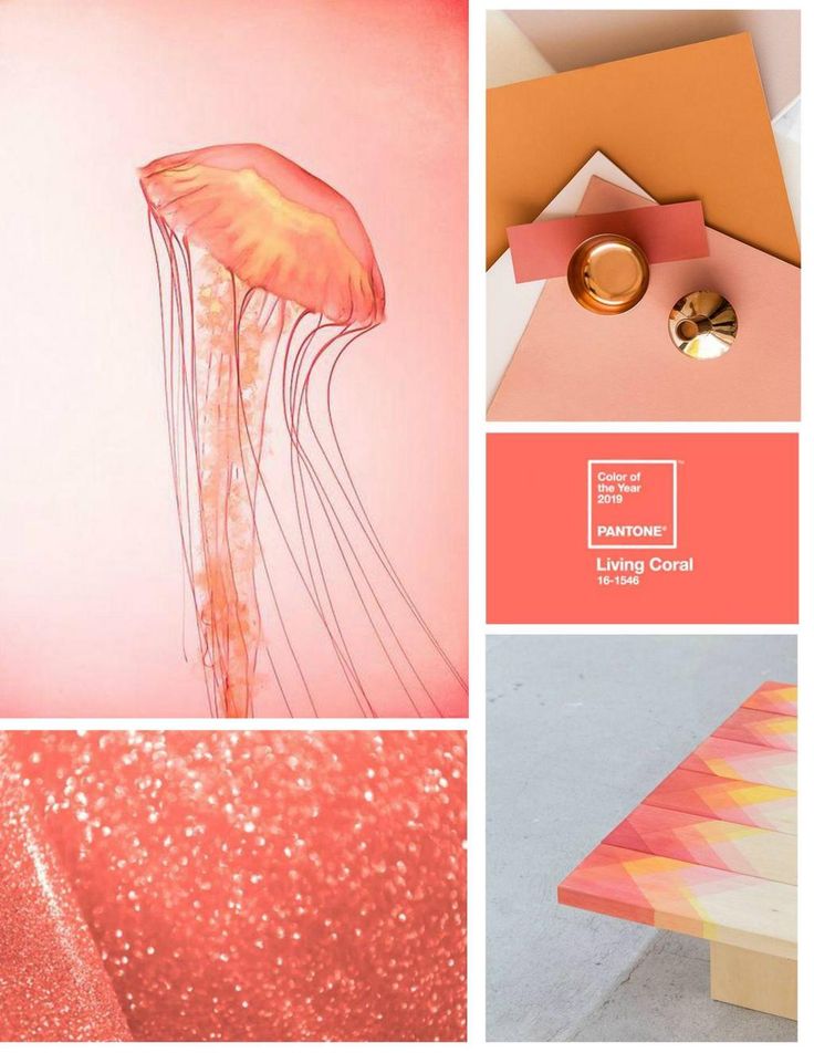
It is important not to overpower this color in your space. Here’s a sample
If you’re still clueless on what are the best colors to pair with this very sociable and energizing color, here are my suggestions:
MY TOP 3 COLORS TO PAIR WITH LIVING CORAL
- BLUE – Hello maximalist! This is such a bold color when partnered with coral it looks gorgeous. Paint your wall blue and buy coral colored decors. Add some gold accents and plants as well and voila!! so pretty new space for you! Can you picture it? 😍 This is for you if you love vibrant and colorful themes. But if you’re a minimalist, then the next one is for you.
- WHITE – As always, white is synonymous to being a ‘minimalist’ The trick here is not to paint your wall coral but to buy one furniture that is coral and make it the focal point. Like a huge sofa or a bookshelf and the rest of your space is all white. Add some plants to break the monotonous white and coral combo. Now you can say: “My space is trendy and up to date”
- GOLD – This shiny color is best used for decors and lightings. If you’ve got a coral wall, pair it up with a gold lighting or a gold bed frame. Throw in some large white faux fur on the floor and some fairy lights and you’ve got yourself a dreamy bedroom fit for a Queen!
There you have it! I’m excited to see how your space will turn out. Tag me on your post. You can reach me on my social channels. For more #design
Happy Decorating! 💕
